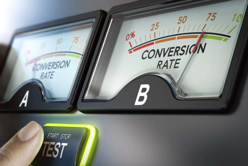
AB Testing UI: How to Design Experiments That Actually Improve Conversion
In this guide, we’ll walk through how to use A/B testing for UI in a practical, business-focused way: from designing solid experiments to interpreting results and turning insights into long-term wins.
Article Overview
- What A/B Testing Is (and Why It Matters for UI)
- When You Should Use A/B Testing in Your Interface
- How to Design a Strong UI A/B Test Step-by-Step
- High-Impact UI Elements to Test First
- Reading the Numbers: Interpreting Test Results
- Common Mistakes That Kill A/B Test Value
- Realistic Examples for Product and Business Teams
- How Khetta Can Support Your Testing and Optimization
1. What Is A/B Testing in UI Design?
A/B testing is a simple idea: you show two different versions of a page or component (Version A and Version B) to similar users at the same time, and measure which one performs better against a specific goal (like signups, clicks, or purchases).
In the context of AB testing UI, you’re usually changing one or a few visual or interaction elements—such as a headline, button, form layout, or step in your onboarding flow—and tracking how users respond in real usage, not just in a lab or survey.
Instead of asking “which design looks better?”, you start asking “which design performs better for our business?” That mindset shift is what makes A/B testing so powerful.
2. When Should You Use A/B Testing for Your UI?
A/B tests work best when you already have traffic or active users, and you want to optimize a specific part of your product. They are not a replacement for user research or UX strategy—but a way to refine and validate your ideas.
2.1 Ideal scenarios for UI A/B tests
- Onboarding flows: testing shorter vs. longer onboarding, tooltips vs. guided tours, or different progress indicators.
- Conversion funnels: changing call-to-action (CTA) placement, wording, or color on landing pages or pricing pages.
- Forms: splitting long forms into steps, adjusting labels, or changing required fields.
- Navigation & menus: testing tab layout, menu structure, or icon vs. text labels.
- Content emphasis: which features, benefits, or testimonials to highlight visually.
2.2 When A/B testing is not the right tool
- You have very low traffic (tests will take too long to be meaningful).
- You’re still at early discovery stage and don’t understand user needs.
- You’re trying to solve a deep UX problem that requires qualitative research.
3. How to Design a Strong AB Testing UI Experiment
A/B testing is not just “change something and see what happens.” To get reliable, actionable results, you need a clear structure. Here’s a practical framework.
3.1 Start with a single, clear goal
Decide what success looks like before you touch the design. Common UI-related goals include:
- Increase signups or account creations.
- Improve completion rate of onboarding steps.
- Boost click-through rate on primary CTA.
- Reduce drop-offs on a specific page or form.
Example: “Increase the percentage of new users who complete onboarding step 3 within 24 hours of sign-up.”
3.2 Form a hypothesis (not just a guess)
A good hypothesis connects a design change to an expected outcome:
“If we add a progress bar to the onboarding UI, more users will complete all steps because they understand how many steps remain.”
This gives you a clear idea to test and a way to learn even if you’re wrong.
3.3 Choose one main change at a time
If you change too many things between A and B, you won’t know what caused the improvement. For most business teams, start with:
- One main visual or content difference (e.g., CTA text or layout).
- Keep everything else as close as possible.
3.4 Decide your sample and duration
For a typical A/B test, you:
- Split users randomly: 50% see Version A, 50% see Version B.
- Run the test long enough to avoid “day of week” bias (often 1–2 weeks minimum).
- Wait until you have enough users to reach a stable result. Many tools help you calculate this.
3.5 Track the right metrics
Don’t just look at clicks. Combine:
- Primary metric: the main goal (e.g., completed signups).
- Secondary metrics: time on task, drop-off rate, errors, or support tickets.
- Guardrail metrics: to ensure you’re not harming something else (e.g., revenue per user).
4. High-Impact UI Elements to Test First
If you’re new to AB testing UI, start where small changes can create big impact. Here are proven candidates.
4.1 Calls-to-action (CTAs)
Your primary CTA is often the most important element on the screen. You can test:
- Text: “Get Started” vs “Start Free Trial” vs “Book a Demo”.
- Placement: above the fold vs below, sticky vs static.
- Visual weight: color, size, icon usage, whitespace around the button.
4.2 Onboarding steps and layout
For onboarding experiences:
- Single page vs multi-step wizard.
- Using tooltips vs a guided checklist.
- Optional vs mandatory profile completion.
4.3 Form design
Forms are friction points. Consider testing:
- Inline validation vs error messages at the top.
- Label position: inside fields (placeholders) vs above fields.
- Short vs long forms, or splitting into steps.
4.4 Visual hierarchy and content emphasis
You can guide the user’s eye using:
- Headline size and contrast.
- Highlighting social proof (logos, reviews, case studies).
- Using cards, icons, or illustrations to clarify features.
5. Interpreting A/B Test Results Without Getting Lost in Statistics
You don’t need to be a data scientist to benefit from A/B testing, but you do need discipline when reading the results.
5.1 Look beyond “B looks better”
Focus on:
- Absolute impact: how many more signups or completions did B generate?
- Relative uplift: e.g., “B increased onboarding completion by 12% compared to A.”
- Consistency: does the improvement hold across different user segments (country, device, traffic source)?
5.2 Respect statistical significance (but stay practical)
Most A/B platforms indicate when a result is “significant,” meaning it’s unlikely to be random. However:
- Don’t stop tests too early just because B looks good after one day.
- Don’t run tests forever—once you reach sufficient data and a stable result, decide and move on.
- Balance statistical purity with business reality: sometimes a clear, strong uplift is enough to act.
5.3 Turn insights into reusable patterns
Each test should leave you smarter, even if B “loses.” Document:
- What you changed and why.
- Who you tested on and for how long.
- What you learned about your users’ behavior.
Over time, this becomes a design playbook you can reuse across your product and future experiments.
6. Common AB Testing UI Mistakes to Avoid
A/B testing can waste time if it’s not set up correctly. Here are pitfalls to watch for.
- Testing without a clear hypothesis: leads to random changes and weak learnings.
- Changing multiple things at once: makes it impossible to know what worked.
- Stopping tests too early: early results are often noisy and misleading.
- Ignoring qualitative feedback: numbers tell you what is happening, not why.
- Over-focusing on micro-optimizations: button color tests are fine, but don’t ignore bigger UX problems.
7. Practical AB Testing UI Examples for Business Teams
7.1 Example 1: Improving onboarding completion
Scenario: A SaaS product sees many users sign up but only 40% complete the onboarding checklist.
Test idea: Add a progress bar and success checkmarks for each step in the onboarding UI.
- Version A: simple list of onboarding tasks, no visual progress.
- Version B: progress bar at the top and green checkmarks as users complete steps.
Result: Version B increases completion from 40% to 52%. The team rolls out B permanently and uses similar progress indicators in other flows.
7.2 Example 2: Increasing demo bookings on a landing page
Scenario: A B2B website has strong traffic from search and ads, but low demo request conversions.
Test idea: Rework the hero section CTA and supporting content.
- Version A: generic headline, “Learn More” button, features list.
- Version B: outcome-focused headline, “Book Your Free Demo” CTA, customer logos and testimonials.
Result: Version B increases demo bookings by 18% without increasing ad spend—pure UI and copy optimization.
7.3 Example 3: Reducing form drop-offs in checkout
Scenario: An e-commerce site sees many users abandon the checkout page.
Test idea: Simplify the form and add inline validation.
- Version A: long single-page form, error messages only after submission.
- Version B: grouped fields, inline error messages, and fewer required fields.
Result: Version B reduces form abandonment by 10%, leading to a direct increase in revenue.
8. How Khetta and Structured AB Testing UI Can Power Your Growth
A/B testing is most effective when it’s part of a broader digital strategy: strong UI/UX design, reliable analytics, and a tech stack that can support rapid experimentation.
At Khetta, we combine:
- Modern web design and development: fast, mobile-optimized interfaces that are ready for testing.
- API-first workflows and automation: to connect your website, CRM, and analytics tools so experiments run smoothly.
- SEO and landing page optimization: ensuring your A/B tests happen on pages that already attract the right visitors.
- RPA and automation tools: to streamline data collection, reporting, and follow-up actions based on test outcomes.
Whether you’re improving onboarding, redesigning your product UI, or optimizing conversion funnels, a disciplined A/B testing approach helps you move from opinion-driven design to evidence-based decisions.
9. Key Takeaways and Next Steps
- A/B testing turns UI debates into measurable experiments.
- Start with clear goals and simple, focused changes.
- Test high-impact areas first: onboarding, CTAs, forms, and hierarchy.
- Document your learnings to build a reusable design playbook.
- Integrate A/B testing into your broader digital strategy for compounding gains over time.
If you’re ready to move beyond guesswork and use AB testing UI to drive real business results, we can help you plan, implement, and optimize a testing program tailored to your product and market.
Schedule Your Free Expert Consultation and let’s design experiments that translate directly into growth, not just prettier screens.